It’s an exciting time for me. I’ve finished writing my new book. The editor is now going over it with a fine-tooth comb. Like a flea comb? LOL!
The book is about my journey to India and on to Sri Lanka in 1975 to help crew a yacht across the Indian Ocean in monsoon season. We ended up, way off course, in Diego Garcia where the yacht got stuck on a corral reef. Then journeyed on to the Seychelles.
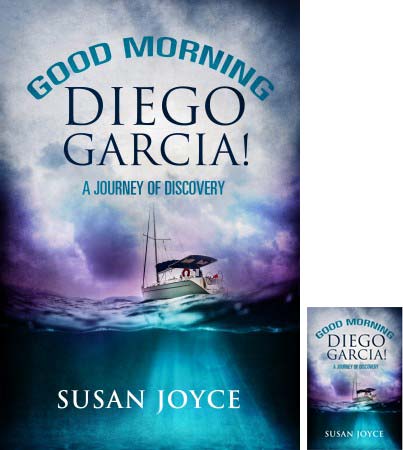
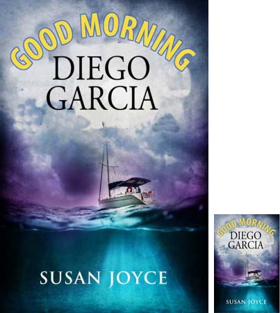
Would love your feedback on the cover. Which should I use?


And why? Or do you have other ideas?
I will send five helpful respondents a complimentary e-copy of Good Morning Diego Garcia when it is published.

I still like the second one
I like the first one best. The colours used make the words stand out more and makes the book look more interesting. Also the words A Journey of Discovery help the reader to see what the book is about.
I liked the top cover as I love the colours in it and thought you couldn’t distinguish them as much in the bottom cover. But as I took a bit of time looking between both I think the second is more dramatic and seems better for the content. The top cover seems quieter and more tranquil. So I’d go with the bottom cover for the book.
Thanks Susan!
I like the top one better! The color coordination is wonderful.
I like the top one better too. It is more mysterious. The yellow looks too sunny. Can’t wait to read!
I prefer the color of the first and the font/size of the “Good Morning” in the second. Congrats, I look forward to reading it!
I like the top one – the lettering font and colour adds depth and intrigue to the design. Good luck with your new release 🙂
I like the both of them, but prefer the first one. I love how the ocean color is carried up to the top. I like the font sizes, too.
Susan, I prefer the top one – the yellow ‘Good Morning’ in the second option seems too much of a contrast with the ‘brooding’ background. Also prefer having a sub-title. The colours are a great combination & very eye-catching. Good luck with the book & I shall look out for it xx
I prefer the first, mainly because the sub title gives a clue as to the nature of the book.
I like the top one best. The lower one looks too bright for the words “Good Morning”. I also like the sub-title for the top one. Good luck!
I like the top one in terms of the colours balancing top and bottom – the ocean blues bleeding into the sky colours.
In terms of the text, and psychology of colours, I’d stick with the yellow ‘Good Morning’ and also keep the exclamation mark of the top version after Garcia. Blue and yellow together create incentive to action in the viewer 🙂 (just ask amazon) the exclamation mark is unusual, yes – but I think it immediately conveys the sense of action and adventure that might be missing without it – otherwise it could look more like a ‘we had fun cruising’ story rather than the high-stakes that are in there.
The only thing that doesn’t work for me is that curving of the text – not good for a professional look.
Otherwise, a very appealing cover!
Actually, just wanted to add re the yellow text…
to avoid it seeming too ‘sunny’ as some mentioned, you could try doing a colour gradient, that shades from yellow at the bottom to a darker, purple/brown menacing colour at the top. A bit like when you have the sun peeking out below storm clouds at sunset – nice sense of menace.
I heartily agree with EVERYTHING Piper says! Straighten the title, keep the gradient yellow and I’ll just add, keep the top one’s subtitle.
I prefer the top one Susan1
I like the first one, the colour co-ordination is better, felt the yellow a little distracting, also stating “a journey of discovery” on the cover gives you a taste of what is to come. Good luck with the book.
The second one is more arresting, surprising and individual. The first one too coordinated, too as expected.