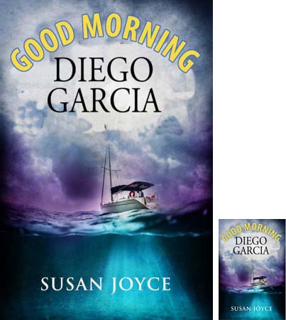
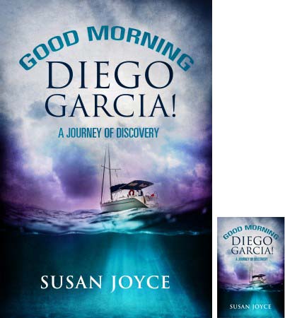
We asked your opinion of a couple of variations of a cover design we ordered (at the bottom of this page). Although nicely done, it was from a low-cost designer, which means the design process is fairly minimal. For a fixed price, you get a design, period (pretty much). We started looking through hundreds of photos, and found one that better conveyed the sense of turbulence (physical and emotional) that runs throughout the story.
So please have a look and share your thoughts!
What appeals to you, and what doesn’t, and why?
 A) dark w/bubble
 B) dark w/glow
 C) light


I like the one with the boat–doesn’t make sense otherwise
With the Journey of Discovery
Waiting, waiting, waiting–do I soynd impatient!!
Sound
1) It has to have the boat.
2) I prefer the one that has the “Good Morning” in a smaller (and less irritating) font.
Cheers,
Don
Thanks for your feedback. I would love to have an image of a 50′ schooner, one mast broken, smashing about in 8-meter swells. Alas, the stock photo agencies let me down on this count. The boat image the cover designer provided is nothing like the boat in the story, nor does it convey the turbulence (physical and psychological) that permeates the story. Not her fault; she hasn’t read it. And indeed, I would love to have an image of a 50′ schooner, one mast broken, smashing about in 8-meter swells.
Hello Susan!
In my opinion the first one works best of the three. (A)
But while the photo is a massive improvement on the earlier version, the typography and design doesn’t really do it justice. Rather, instead of the ‘airbrushed’ light blobs and dark lines, use a transparent rectangle in contrasting colours to bring the text forward. The curved text at the top is rather dated and I’ve heard that referred to as ‘early 90s desktop’ – I do understand that it signifies the morning rays of the sun but white text on two lines or a cut-out effect on a white translucent rectangle would give it a more upmarket and contemporary look. I’d lose the yellow colour too, and opt for white, greys and black instead.
I like the ‘One woman’s journey…’ bit at the bottom.
Hope these remarks don’t come across as too critical. Have restrained myself from commenting thus far but the photo gave me hope that you’d like to change it for the better.
Best of luck with your book – I hugely look forward to reading it!
Savyra
Thanks Savyra, for your insights and specific suggestions!
Of the three, I like “C.” I had to revisit a few times to be sure. Of all, I like the bottom one with the boat… #5.
At first, I didn’t like the bottom two because they looked a bit scary, when I re-read your thoughts of conveying turbulence, I decided the bottom 2 depicted that batter in my opinion. Blessings!